This case study documents the re-architecture and redesign of two Crimson Education platforms:
Revision Village (RV) and Crimson Global Academy (CGA). Working within Crimson's dynamic startup culture,
my challenge was to evolve these platforms to meet aggressive expansion goals while navigating
constant organizational change.
The core mission was to scale both platforms without alienating the 1.3 million students who relied
on their simplicity and effectiveness.
As part of a cross-functional team, I contributed to design strategy and execution from initial
information architecture through final UI, ensuring every design decision balanced user needs
with business growth objectives.
02. The Challenge
Honoring Legacy While Forcing Evolution
The original RV was successful because of its focused simplicity. Our
primary challenge was to evolve it from a single-subject site into a
multi-subject, multi-curriculum platform following the Crimson acquisition.
This meant a significant increase in complexity. The central question became:
How could we introduce this complexity without destroying the clean, efficient UX
that users loved?
Operating in a Dynamic Startup Environment
Working within Crimson's fast-moving startup culture presented unique challenges.
With frequent leadership changes and shifting priorities,
requirements and product vision evolved constantly. This created a dynamic environment
where adaptability was as important as design skill.
Operating Within Startup Constraints
In a lean startup environment without dedicated UX research budgets, we relied on
analytics and proxy data to inform design decisions. This taught us to be resourceful
and find creative ways to validate design choices using available tools like Datadog.
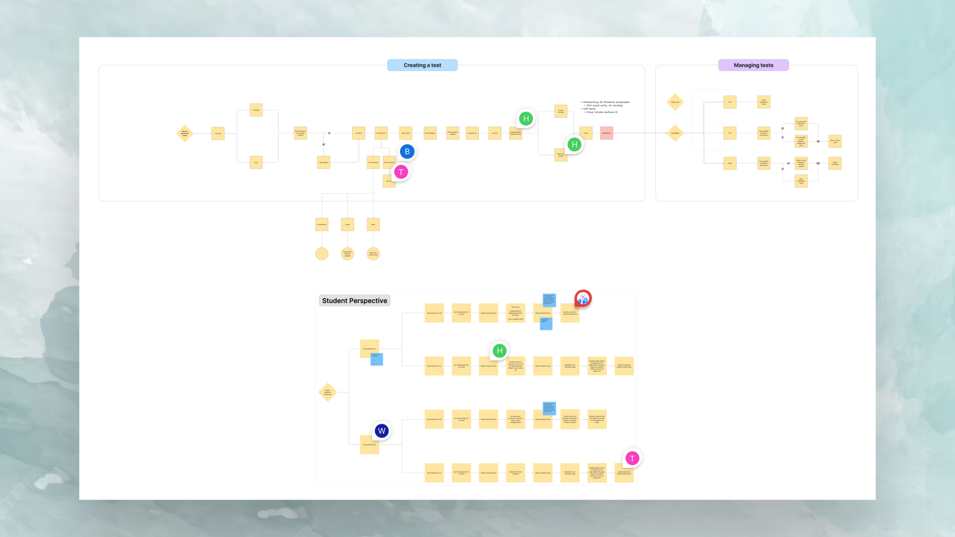
03. The Solution
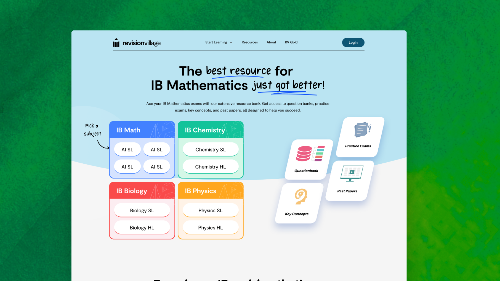
Intent-Driven Navigation
To solve the content navigation problem, I took inspiration from
high-intent platforms like airline booking sites. I designed a central
module that prompts users to declare their intent first—"Which
curriculum and subject are you studying?". This single interaction
steers them directly to relevant content, making the vast increase in options feel manageable.
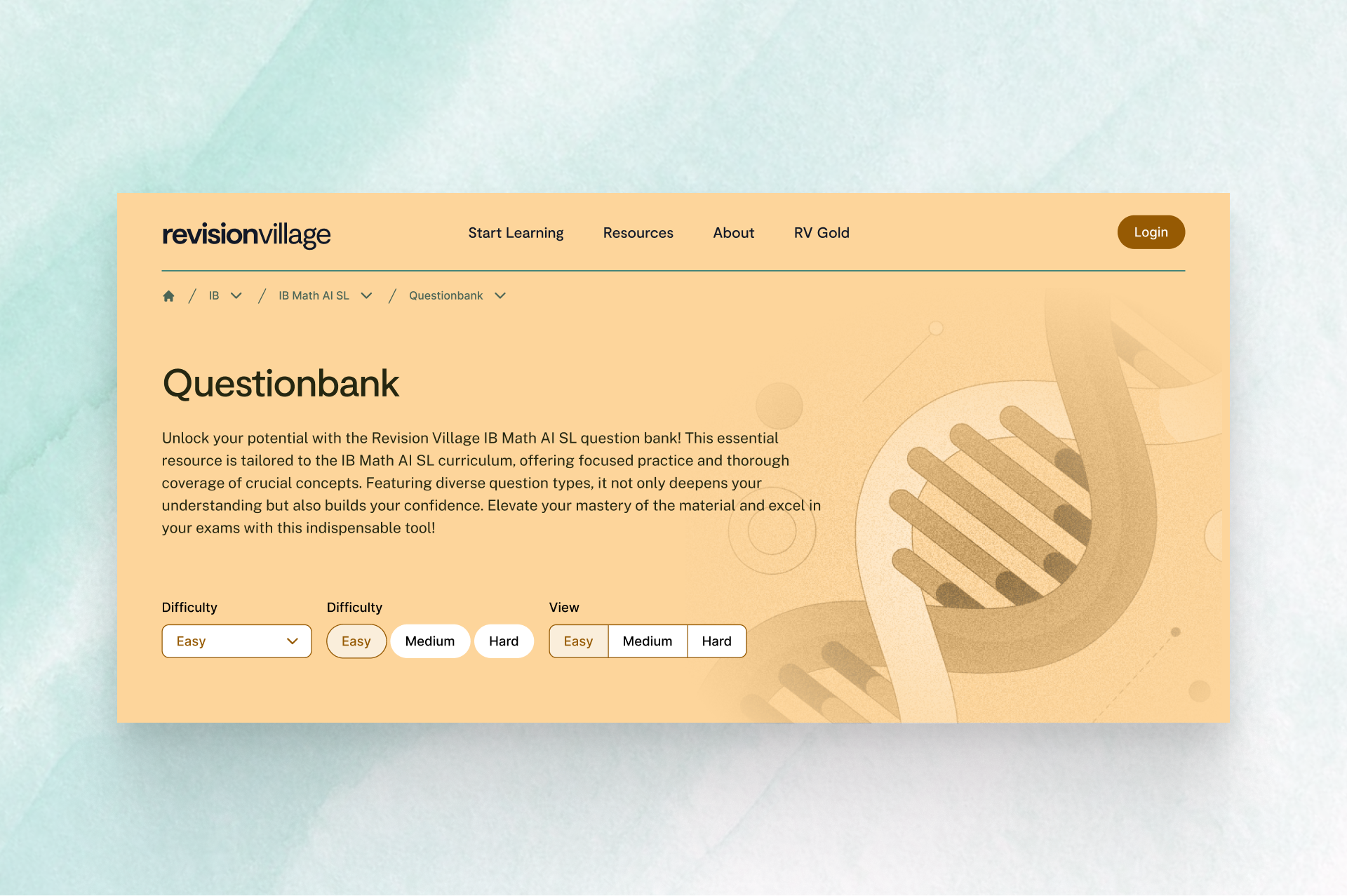
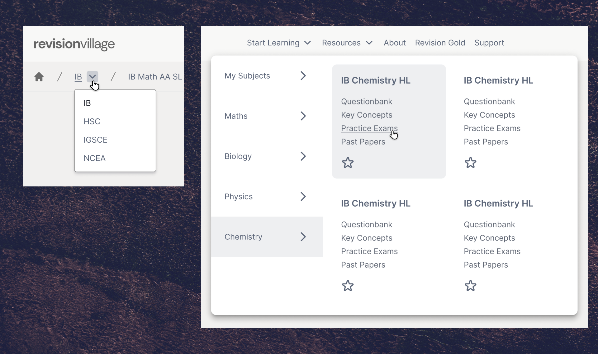
I added mega menu to the header navigation. This meant that students
who have more than one subject with us, were able to quickly switch
between them.
Considering how similar all pages were, it was very easy to get lost
on the site. To tackle this, I implemented breadcrumbs that have
segmented dropdowns, allowing the user to quickly jump to almost any
educational page on the site.
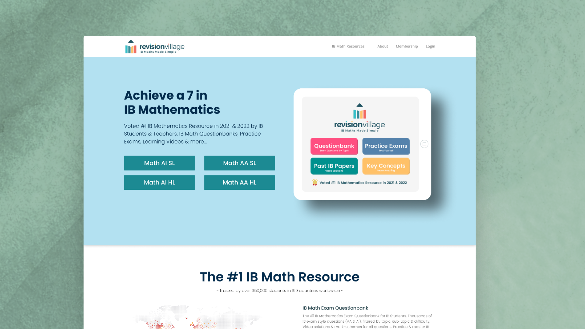
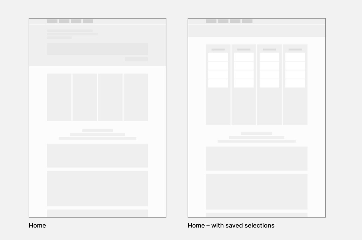
The old homepage which served a single subject and curriculum
The new homepage module allows users to quickly select their curriculum and subject, streamlining access to relevant content
Introduced breadcrumbs that allow for quick switching. Navigation now scales to multiple subjects and curricula
Maintaining Design Consistency in a Dynamic Environment
To maintain consistency amidst changing priorities, our team embraced transparent
design practices. We used Figma as our central source of truth, documenting decisions
and rationale openly. This collaborative approach helped new team members understand
the context quickly and ensured design continuity even as requirements evolved.
If everyone has a say, what goes ahead?
With so many stakeholders and shifting priorities, I relied heavily on insights from Datadog to guide decision-making. By surfacing real user behavior and pain points, I was able to prioritize features and fixes that had the greatest impact. This data-driven approach helped align stakeholder opinions and ensured our roadmap focused on what mattered most to users and the business.
04. Outcome & Lessons
The redesign was a significant commercial and user experience success.
By navigating the complex environment and focusing on scalable,
user-centric design, my work directly contributed to a sustained year-on-year sales growth of 30-50% and successfully opened up a new teacher market.
Thriving in Dynamic Environments. This experience
taught me how to maintain design quality and user focus in a fast-moving startup
environment. Clear documentation and transparent processes became essential for
preserving design intent across changing priorities.
Resourcefulness in Research. Operating without formal
research budgets taught us to leverage analytics and available data for
evidence-based design decisions. This constraint-driven approach often led to
more focused, high-impact solutions.
Balancing User Needs and Business Goals. Every design
decision required careful consideration of both user experience and business
objectives. This taught us to find solutions that served both masters effectively.
Let's Create Something Remarkable.
I'm currently available for freelance projects and collaborations. If you
have an idea you're passionate about, a problem that needs solving, or just
want to connect, I'm all ears... or eyes?.