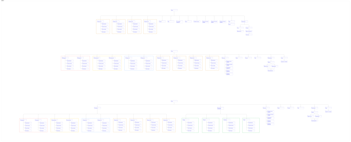
Information architecture detailing the current, single curriculum and multiple curriculum structure

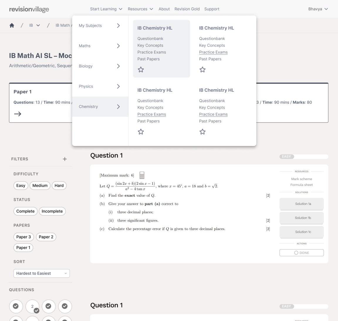
The "mega" navigation menu used for quick access to all pages
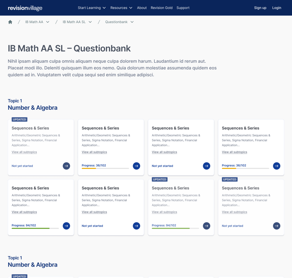
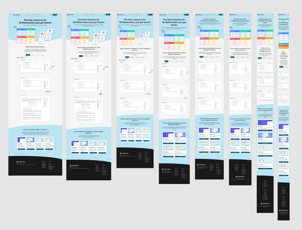
Wireframes created
Working closely with co-founders and the CEO, more of my ideas started getting validated. The navigation structure was finalised along with some UX improvements that have still carried on till today. Example of these are:
Tracking question progress
Jumping/navigating to another question
Creating filters
Using specialized breadcrumbs to navigate to other sections of the site
As I wasn't given access to our users, based on friends and colleagues still studying in higher and tertiary education, navigation on Revision Village was smooth but with the large lists of questions, it was hard to jump to questions when revisiting them at a later point in time. This also meant that they sometimes didn't know where they left off, hence introducing progress tracking. Some had very specific learning preferences such as using external study resources only for the challenging questions, so they would need a way to filter out questions with lesser difficulty.

First injection of colour into the wireframes.
Hurdles
One notable hurdle in RV involved a high turnover of product managers, resulting in a lack of consistent direction for styling, branding, and creative aspects. This situation posed a significant challenge, requiring adaptability to diverse managerial styles and agendas. As a result, the designs remained in this grayscale stage until a decision was made to consider a rebrand.
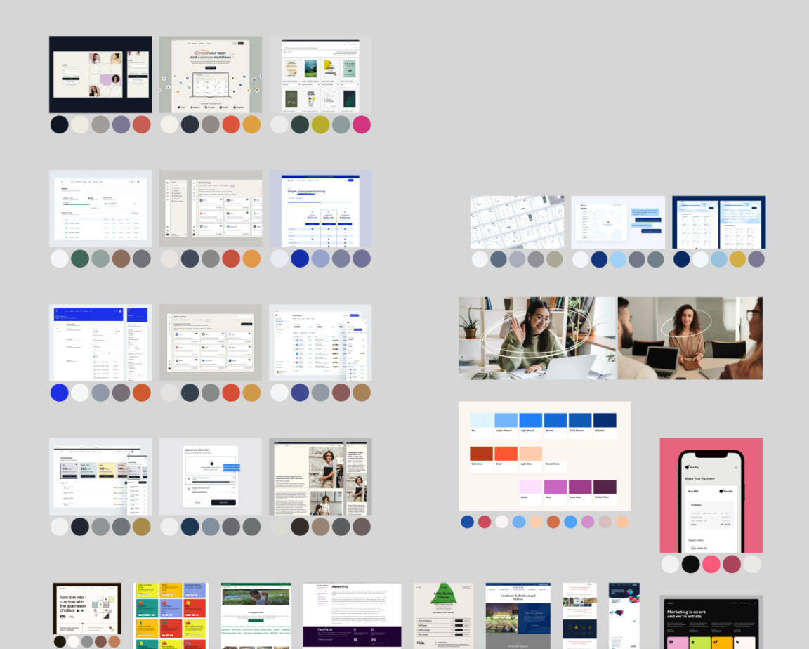
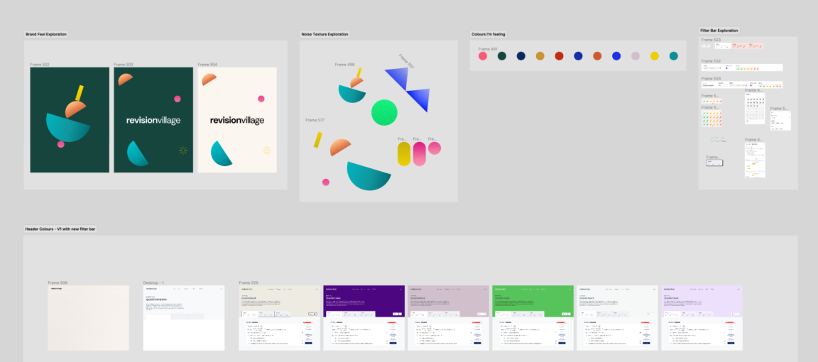
New stakeholders wanted a bit more character and fun in the designs, which led me to create a mood board for everyone to feedback on and start a more open and transparent designing style. Designing in public is a known style, but this time with the constant changes in direction, my work was open for anyone to critique and make changes to.

Exploring illustrators in headers

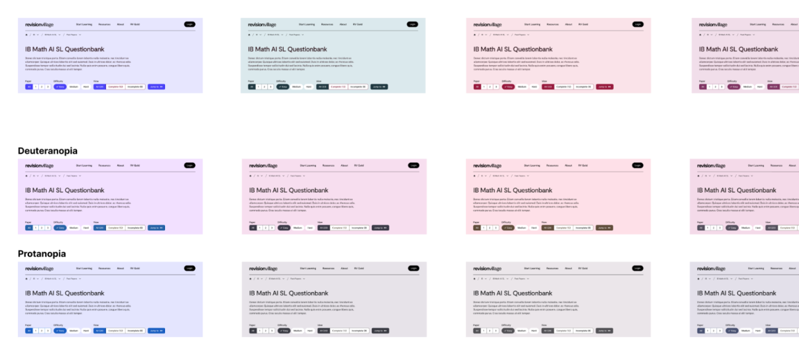
Colour blind tests for Deuteranopia and Protanopia vision.
Accessibility
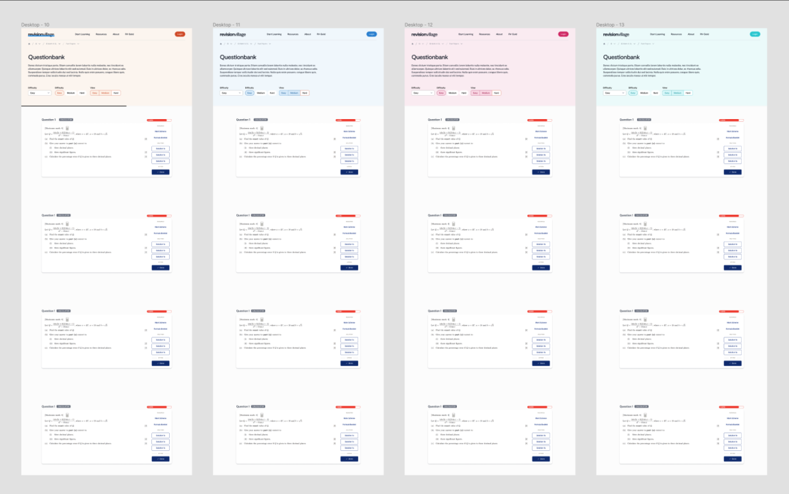
RV has a lot of pages, and every page with questions looked somewhat similar. The founders had colour-coded specific topics, however, this was only effective for one subject and a specific set of topics per subject. I abstracted this a level up and applied a unique color to each subject. This allowed users to instantly recognise what subject they were in and use it accordingly.
To make these colours more accessible, I ran colour blindness tests too.

New colour schemes applied to the headers of pages
Formative Assessments
Students were responding very well to the new life that Crimson had breathed into Revision Village, however, the next target group were teachers. Teachers needed a better way to allocate work to students without making each student pay for a Revision Village membership. RV's content creators, who also are examiners and teachers in the IB, had used the IB's own platform to create test papers for students to take home. In comparison, when creating a similar feature at RV, we wanted to make this process incredibly simple.
Our main goals were
Teachers should be able to create a quick test with very basic parameters (length, number of questions, difficulty, and topics)
Teachers should have full control over the order their questions are displayed in
Teachers should easily be able to distribute these questions (including a subset of questions only accessible to teachers) to students, who get access to otherwise locked questions for the duration of the test.
Grade student submissions and for the first time ever, get preliminary grading assistance via Newton AI
Provide insights on student performance.
At the time of writing this, assessments are still a work in progress but we received very positive feedback and over a thousand test submissions in the first week of launching. Teachers are actively using Newton AI to grade their papers. Student insights show how the class did as a whole on the test and provides a visual understanding of individual and overall class perforamnce.

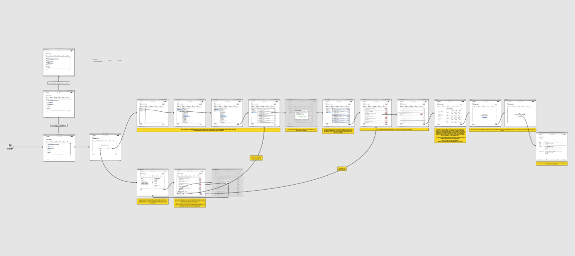
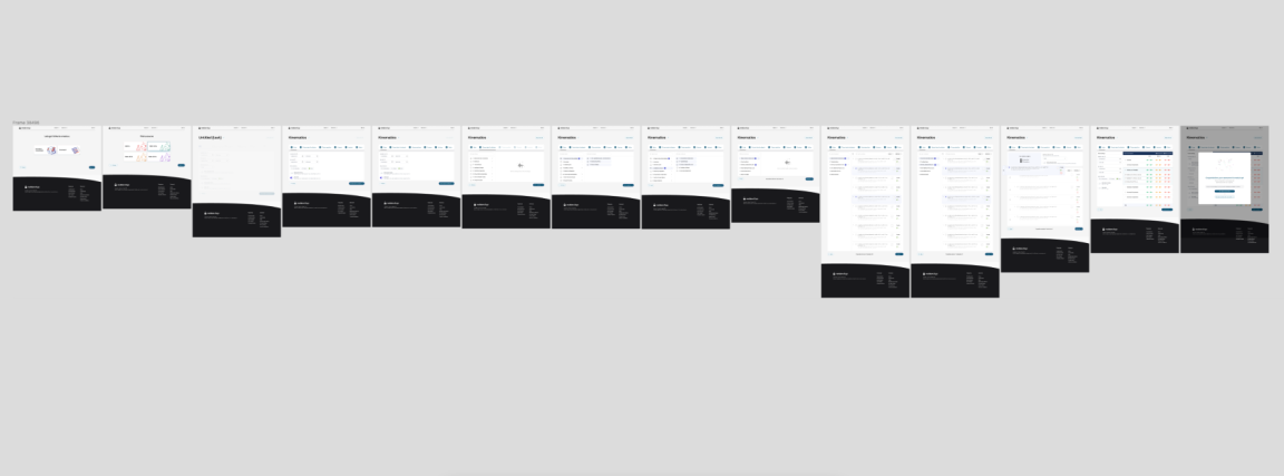
Wireframe and user journey the test creation flow

Teacher's flow of initiating, collating questions, organising questions and distributing tests. More flows exist to capture grading and viewing assessment submissions.

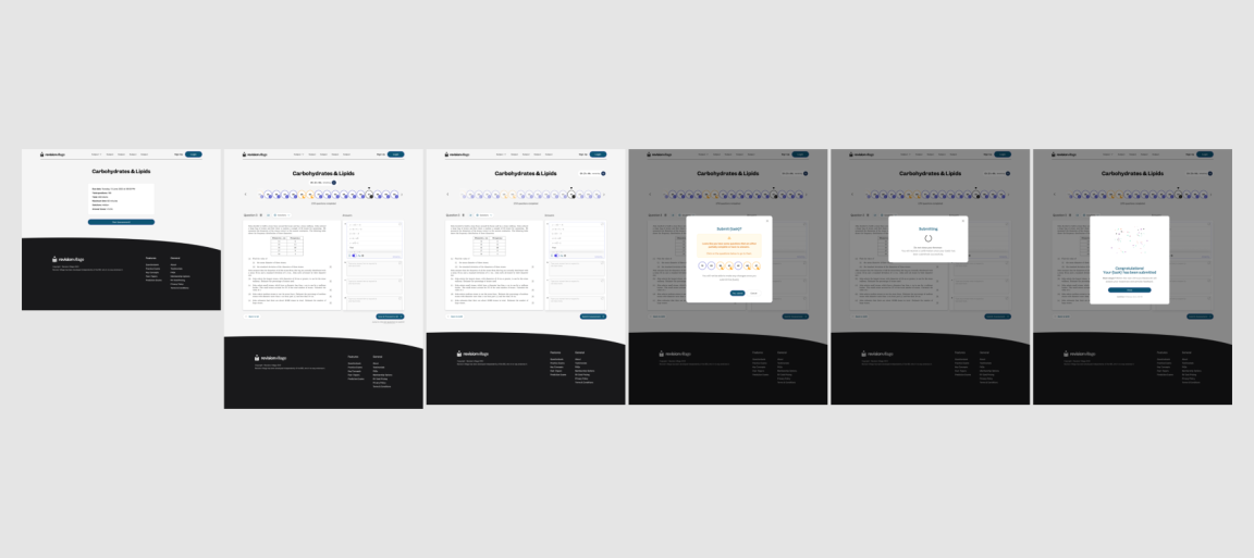
Student flow of taking and submitting tests. Not the full flow.
The outcome
The goal from the beginning was to ensure a newly acquired product doesn't fail. We knew what worked well and didn't fix what was not broken. The existing UX of the site was improved upon, allowing for a much easier and customizable learning experience. We have not only kept the site afloat but managed to increase sales from 30-50% YOY growth.
Some learnings:
A lot of my decisions were based on expert knowledge from our content creators and website usage reports. As much as I advocated for it, we never approached a single user for interviews or feedback. Each change in the product leadership resulted in a different focus, and creative direction was not prioritized.
